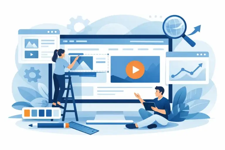
Most small business websites do not have a traffic problem first. They have a conversion problem. You can pay for SEO, ads, and social media, but if the site feels unclear, slow, outdated, or hard to trust, visitors leave without contacting you. That is why a guide to conversion web design matters. Good web design is not just about looking professional. It is about helping the right person take the next step.
For small businesses, that next step is usually simple. It might be a call, a form submission, a quote request, or a booking. The mistake is treating every website like a digital brochure and hoping people figure it out on their own. Conversion-focused design removes friction. It answers questions quickly, builds confidence, and makes action feel easy.
What conversion web design actually means
Conversion web design is the practice of designing a website around business outcomes, not just appearance. A conversion happens when a visitor does what you want them to do. For a local service business, that could mean requesting an estimate. For a consultant, it might be scheduling a discovery call. For a clinic, it could be completing a booking form.
That sounds obvious, but many websites are still built around internal preferences instead of customer behavior. The owner wants a flashy homepage. The team wants to include every service on one screen. The designer wants something visually clever. Meanwhile, the visitor just wants to know three things fast: what you do, whether they can trust you, and how to contact you.
This is where conversion design differs from standard design. Standard design asks, does it look nice? Conversion design asks, will this page help a qualified visitor move forward?
A guide to conversion web design starts with clarity
If your homepage cannot explain your business in a few seconds, design is not the main issue. Messaging is. Many small business websites lose leads because they lead with vague slogans, oversized banners, or generic claims like quality service and customer satisfaction. Those phrases do not help a visitor decide.
Clear messaging does. Your headline should say what you offer, who it is for, and why it matters. Your supporting copy should explain the problem you solve and what makes your approach credible. Then your call to action should tell visitors exactly what to do next.
A strong page does not try to say everything at once. It prioritizes. The user should not have to hunt for your core service, your location, your pricing approach, or your contact method. If they have to work too hard, they will leave.
Trust is a design function, not just a branding detail
Many business owners think trust comes from having a logo, brand colors, and a polished layout. Those help, but trust usually comes from specifics. Real testimonials, recent work, clear service descriptions, staff photos, pricing signals, business credentials, and an obvious contact process all reduce doubt.
This matters even more for service businesses. People are not buying a product off a shelf. They are evaluating risk. Can this company do the job? Will they communicate well? Will they waste my money? A conversion-focused website addresses those concerns before the visitor asks.
Design plays a direct role here. If pages are cluttered, mobile layouts break, forms are too long, or key details are hidden, credibility drops. Visitors may not say your website felt untrustworthy. They just leave. That is the real cost of poor design.
The most important conversion elements on a small business website
There is no single formula that works for every company, but most high-performing small business websites get a few fundamentals right.
First, they make the offer easy to understand. Visitors should know exactly what service is being offered and who it is for. Second, they use strong calls to action consistently. If your main goal is generating leads, your buttons, forms, and page structure should support that goal across the site, not just on the contact page.
Third, they keep navigation simple. Too many menu items create hesitation. Most small businesses need a lean structure with clear paths to services, proof, about information, and contact. Fourth, they respect mobile users. On many small business sites, mobile traffic is the majority. If the mobile experience is cramped, slow, or confusing, conversion rates suffer quickly.
And fifth, they reduce unnecessary friction. That means shorter forms, faster pages, readable text, clear page sections, and fewer distracting design choices. Not every visitor is ready to buy immediately, but your site should make it easy for ready visitors to act.
Why visual design still matters
Conversion-focused design is not ugly, mechanical, or stripped of personality. Good visual design still matters because it shapes first impressions and influences confidence. The point is that visual choices should support action, not compete with it.
Clean layouts, good spacing, readable typography, and consistent color use make a website feel easier to use. Strategic contrast helps key actions stand out. Professional imagery can strengthen credibility. A modern design signals that the business is active and serious.
The trade-off is that some visually dramatic choices can hurt performance. Overbuilt animations, crowded hero sections, trendy layouts, and oversized media often make websites slower and harder to scan. A site can win design compliments and still lose leads. For most small businesses, clarity beats cleverness.
SEO and conversion work best together
A common mistake is treating SEO and conversion as separate projects. One gets people to the website. The other turns those visits into enquiries. If either side is weak, results flatten.
A conversion-focused website should be structured so search traffic lands on pages that match intent. Someone searching for a specific service should not arrive on a generic homepage and start guessing. They should land on a page that clearly explains the service, shows trust signals, and gives them an easy next step.
This is especially important for businesses competing in practical service categories. Ranking matters, but relevance matters just as much. Traffic that does not convert is not the win it appears to be.
What small businesses often get wrong
The most expensive website mistake is building around preferences instead of evidence. A founder may want every detail on the homepage. A freelancer may deliver something attractive but strategically thin. A DIY builder may make publishing easy while leaving performance, structure, and conversion weak.
Traditional agencies can miss the mark too. They often add layers of process, complexity, and cost that smaller businesses simply do not need. You end up paying for presentations, meetings, and creative concepts while the essentials of trust, speed, and lead generation stay underdeveloped.
A better approach is practical. Start with business goals, user questions, and a realistic conversion path. Then design around those priorities with pages that are easy to maintain and improve over time.
How to evaluate your current website
If you are unsure whether your site is helping or hurting, look at it like a first-time buyer. Can you tell what the business does within five seconds? Is the main service obvious? Is there a strong reason to trust the company? Is the next step clear on every key page? And does the site feel fast and easy to use on mobile?
Then look at behavior. Are people visiting but not inquiring? Are ads driving clicks with little return? Are contact forms too quiet even though traffic exists? Those are often signs of conversion issues rather than visibility issues.
Not every website needs a full rebuild. Sometimes better messaging, stronger calls to action, improved layout, and cleaner service pages can make a meaningful difference. But if the site is dated, hard to update, poorly structured, or slow across devices, patching it may cost more in the long run.
The best guide to conversion web design is the one you can apply
The goal is not to chase a perfect website. It is to build a credible, focused website that helps your business grow. For small businesses, that usually means a site that loads quickly, explains services clearly, ranks sensibly, and turns attention into action.
That is also why ongoing support matters. A website is not a one-time design file. Offers change, services expand, testimonials grow, and search behavior shifts. Businesses that treat their website as an active sales tool usually outperform those that launch once and ignore it.
At Duo Makers Studio, that practical mindset is the point. A website should not trap you in agency overhead, freelancer inconsistency, or DIY limitations. It should give you a dependable platform for credibility, enquiries, and steady growth.
If your website looks fine but still is not producing enough leads, trust what the numbers are telling you. The issue may not be traffic. It may be that visitors are arriving interested and leaving unconvinced.